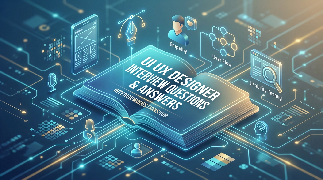
Designing the Perfect Interview: From Pixels to Psychology
You’ve spent weeks polishing your portfolio, ensuring every case study has the perfect balance of white space and high-fidelity mockups. But then you sit down, and the lead designer asks: “Tell me about a time you had to defend a design decision that the data suggested was wrong.” Suddenly, your beautiful Figma frames can’t save you. It’s a common pain point; the gap between being a great designer and being able to articulate your process under pressure is huge. Whether you’re a fresher trying to land your first “Junior” role or an experienced pro eyeing a Lead position, the interview is where you prove you aren’t just a “pixel pusher” but a strategic problem solver.
This guide is for those who want to sound like a seasoned collaborator, not just a freelancer. We’ve gathered the most impactful UI UX designer interview questions and answers that reflect the product challenges of 2026. You’ll learn how to break down your design thinking, justify your UI choices, and prove that you can drive user delight while hitting business KPIs.
Quick Answer
To excel in a UI UX Designer interview, you must demonstrate a deep understanding of the user-centered design process, clear visual hierarchy, and the ability to iterate based on feedback. Success hinges on showing how your design choices solve specific user pain points while aligning with broader business objectives.
Top 5 UI UX Designer Interview Questions
- Can you walk us through your design process for a recent project?
- How do you handle negative feedback from stakeholders on a design you love?
- What is the difference between User Experience (UX) and User Interface (UI)?
- How do you ensure your designs are accessible to all users?
- What tools and methods do you use for user research and testing?
QUICK OVERVIEW TABLE
| Topic | No. of Questions | Difficulty Level | Best For |
| Design Foundations | 5 | 🟢 Beginner | Freshers |
| User Research & Testing | 5 | 🟡 Intermediate | All Levels |
| Visual Design & Systems | 5 | 🟡 Intermediate | UI Specialists |
| Strategy & Leadership | 5 | 🔴 Advanced | Senior Designers |
MAIN Q&A SECTION
1. What is the fundamental difference between UI and UX?
🟢 Beginner
In my experience, people use these as synonyms, but they’re very different layers of the same cake. UI (User Interface) is the visual part—the buttons, colors, fonts, and spacing that users interact with. UX (User Experience) is the internal “feeling” and the logical journey. It’s the research, the wireframing, and the mapping of how someone gets from point A to point B without getting frustrated. Honestly, a beautiful UI on a bad UX is like a Ferrari with no engine; it looks great, but it isn’t going anywhere. You need both to create a product that actually works for people.
2. Can you explain your design process from start to finish?
🟡 Intermediate
Here’s the thing: every project is a bit different, but I always stick to a “Design Thinking” framework. It starts with Empathy—understanding the user through research. Then, I Define the problem and Ideate solutions through lo-fi sketching. After that, it’s all about Prototyping in Figma and, most importantly, Testing with real users. A lot of candidates miss this, but the process shouldn’t be linear. In a real-world setting, you’ll often find during testing that you need to go back to the “Define” stage. Showing that you’re willing to loop back based on data is actually really important to hiring managers.
3. How do you approach designing for accessibility?
🟡 Intermediate
Honestly, accessibility (A11y) shouldn’t be an afterthought; it should be baked into the first wireframe. I follow the WCAG guidelines to ensure high color contrast for users with visual impairments. I also make sure our touch targets are large enough for mobile users and that the information architecture works for screen readers. For example, in a recent project, I insisted on adding descriptive “Alt Text” for all functional icons. This isn’t just about being “nice”—it’s about ensuring the product is usable by the widest possible audience, which eventually leads to better business metrics.
4. What is a “Design System” and why do we need one?
🔴 Advanced
Think of a Design System as a “single source of truth” for a product team. It isn’t just a UI kit in Figma; it’s a collection of reusable components, patterns, and documentation that both designers and developers follow. In my experience, without a design system, a product eventually becomes a “Frankenstein” of different button styles and inconsistent spacing. A solid system allows the team to scale faster because you aren’t reinventing the wheel every time you need a new modal. It ensures brand consistency across the entire ecosystem, which builds user trust.
5. How do you handle a situation where data contradicts your design intuition?
🔴 Advanced
This one trips people up because they want to sound “right.” In reality, a senior designer should always let the data win, or at least use it as a prompt for more questions. If my intuition says a “Floating Action Button” is the best solution, but heatmaps show users are ignoring it, I don’t argue with the screen. I investigate why. Maybe the placement is wrong, or the color doesn’t pop. I’ll usually propose an A/B test to validate a new hypothesis. Honestly, our “ego” is the biggest enemy of good UX. Data is just a tool to help us see clearly.
6. What are the key elements of a successful user persona?
🟢 Beginner
A good persona isn’t just a stock photo with a name and a list of hobbies. It needs to be rooted in real data. A successful persona highlights the user’s Goals, Pain Points, Behaviors, and Motivations. In my experience, the most valuable part is the “Pain Point.” For instance, if you’re designing a banking app, knowing that “Suresh” is terrified of making a mistake with a transfer is more important than knowing he likes cricket. It gives the design team a specific problem to solve, making the resulting UX much more empathetic and targeted.
7. How do you decide which features to prioritize in a MVP?
🟡 Intermediate
Prioritization is about finding the intersection of User Value and Technical Feasibility. I usually use a “MoSCoW” method (Must have, Should have, Could have, Won’t have) or an Impact/Effort matrix. Here’s the thing: you can’t build everything at once. I’ll work closely with the Product Manager to identify the “Core Value Proposition.” If we’re building a food delivery app, the “Search” and “Checkout” are Must-haves. A “Loyalty Points” system might be a “Could-have” for later. This approach ensures we launch something functional quickly rather than waiting months for a “perfect” but bloated product.
8. What is “Information Architecture” (IA) and how do you test it?
🟡 Intermediate
IA is the skeleton of your product—it’s how content is organized and labeled. If the IA is bad, the user gets lost. I test this using “Card Sorting” or “Tree Testing.” In a card sort, you ask users to group items into categories that make sense to them, not the internal company jargon. I once worked on an e-commerce site where we thought “Electronics” should be its own category, but users kept looking for “Headphones” under “Accessories.” Tree testing helped us realize our labels were the problem. It’s all about making the path to content as frictionless as possible.
9. How do you keep up with the latest design trends?
🟢 Beginner
Hiring managers ask this to see if you have genuine passion. I don’t just look at Dribbble “shots”—which are often pretty but impractical. I follow deep-dive case studies on Medium, look at the “Awwwards” winners, and stay updated on Apple and Google’s Human Interface Guidelines. Lately, I’ve been focusing heavily on how AI is changing UI patterns, like “Generative UI.” Honestly, the best way to stay current is to constantly play with new apps and analyze why they made certain design choices.
10. Can you explain the concept of “Mobile-First” design?
🟢 Beginner
Mobile-first design means you start the design process by designing for the smallest screen and then scaling up for desktop. Why? Because the constraints of a small screen force you to prioritize the most important content and actions. If you start with desktop, you often end up with a cluttered mobile experience that tries to cram too much in. By starting with mobile, you ensure that the “core” experience is solid. In 2026, with most traffic coming from mobile devices, this is actually really important for the success of any digital product.
11. What is the difference between a “Wireframe” and a “Prototype”?
🟢 Beginner
Think of a wireframe as the architectural blueprint of a house—it shows where the walls and doors go, but there’s no paint or furniture. It’s all about layout and structure. A prototype is a clickable, interactive version that mimics the final product. It’s the “test drive.” Wireframes are for aligning on the flow; prototypes are for testing the interaction. In my experience, skipping the wireframe stage and going straight to high-fidelity design is a mistake because it makes it much harder to change the “bones” of the design later when the client is distracted by colors.
12. How do you handle “Design Debt”?
🔴 Advanced
Design debt happens when you take shortcuts to hit a deadline—like using a non-standard button or skipping a proper documentation step. Over time, these small “loans” add up and make the product inconsistent. As a senior designer, I advocate for “Design Sprints” specifically focused on cleaning up this debt. I track it just like a developer tracks technical debt. Honestly, if you don’t manage it, you’ll eventually reach a point where adding a new feature takes three times longer than it should because the foundation is so messy.
13. What is “Affordance” in UI design?
🟡 Intermediate
Affordance is a property of an object that tells the user how to use it. A physical button “affords” clicking; a handle “affords” pulling. In UI design, we use shadows and gradients to give a button a 3D look, signaling it can be pressed. If a link doesn’t look like a link, it has poor affordance. This is actually really important for intuitive design. If a user has to “think” about whether they can click something, you’ve already failed the UX test. We want to reduce cognitive load by making every interaction obvious.
14. How do you collaborate with Developers?
🟡 Intermediate
Collaboration starts on day one, not at the “Handoff.” I involve developers during the ideation phase to see if my designs are technically feasible. When it comes to the actual handoff, I use tools like Figma’s Dev Mode to provide clear specs, spacing, and asset exports. I also provide “Edge Case” designs—what happens when the network is slow? What if the user has a very long name? Honestly, the best designs are the ones that actually get built correctly, and that only happens when you have a strong relationship with your dev team.
15. What are the common UX metrics you track?
🔴 Advanced
I don’t just look at “looks.” I look at the “Heart” framework: Happiness (CSAT/NPS), Engagement, Adoption, Retention, and Task Success. For example, if I redesign a checkout flow, the “Task Success Rate” and “Time on Task” are my north stars. If people are finishing the checkout 30 seconds faster, that’s a direct win for the business. Showing that you understand how your design impacts the bottom line—like reducing “Churn” or increasing “Conversion”—is what will get you hired at a top-tier product company.
COMPARISON TABLE: UX RESEARCH METHODS
Choosing the right research method depends on the “What” and “Why” of your problem.
| Method | Best For | Qualitative/Quantitative | Phase |
| User Interviews | Understanding motivations/feelings | Qualitative | Discovery |
| A/B Testing | Comparing two specific UI versions | Quantitative | Post-Launch/Optimization |
| Usability Testing | Finding where users get stuck | Qualitative | Prototyping |
| Surveys | Gathering data from a large group | Quantitative | Discovery/Validation |
INTERVIEW TIPS SECTION
- Master the Whiteboard Challenge: If you’re asked to design an app for “an elevator for a 100-story building,” don’t just draw buttons. Ask questions: Who is the user? Is there an emergency mode? How do we handle crowds? Process > Final Drawing.
- Narrate Your Case Study: When showing your portfolio, don’t just talk about the “Final UI.” Spend 70% of your time on the Problem and the Iteration. Show the messy sketches and the “failed” versions—it proves you can think.
- Think Like a Business Owner: Designers often forget that the app exists to make money or save costs. Link your design choices to business goals like “Increasing average order value” or “Reducing support tickets.”
- Show Empathy for the Team: Mention how you handle disagreements or how you’ve helped a junior designer. UI UX is a team sport; the interviewer wants to know if they’ll enjoy working with you for 40 hours a week.
- Practice the “Soft Skills”: Use “I” for your specific contributions and “We” for team efforts. Be honest about what you didn’t know and how you learned it. Humility and curiosity are huge “Green Flags.”
WHAT INTERVIEWERS REALLY LOOK FOR
When I’m interviewing for a UI UX role, I’m looking for Strategic Intent. I want to know that every pixel on the screen has a reason for being there. If you say, “I chose blue because it looks nice,” that’s a red flag. If you say, “I chose blue to align with the brand’s trustworthy persona and because it has a 4.5:1 contrast ratio,” you’ve won me over.
We also look for Critical Thinking. Can you handle it when someone pokes holes in your design? A senior designer shouldn’t get defensive; they should get curious. We want to see Engineering Empathy—do you understand the effort required to build your complex animations? Finally, we look for Storytelling. Can you take us on a journey through the user’s eyes? If you can make us feel the user’s frustration and then show us how you solved it, you’re the candidate we’re looking for.
FAQ : UI UX Designer Interview Questions
Not necessarily. While a degree in HCI or Graphic Design helps, a strong portfolio of real-world projects and a deep understanding of design principles often carry more weight in 2026.
Figma is the industry standard for UI design and prototyping. However, tools like Adobe XD and Framer are also popular for specific workflows. Focus on the process, as tools change.
Build a portfolio with 2-3 deep case studies. You can do “Redesign” projects for existing apps or solve a specific problem you see in your daily life. Focus on showing your thinking process.
Research is the “Discovery” phase (interviews, data analysis). Design is the “Solution” phase (wireframing, UI). In small companies, one person often does both; in large firms, they are separate roles.
It’s a usability inspection where you evaluate a design against a set of established principles, like “Nielsen’s 10 Usability Heuristics.” It’s a fast way to find major UX flaws.
The text on buttons and labels (Microcopy) significantly impacts UX. Good microcopy guides the user and reduces anxiety. A button that says “Confirm Payment” is better than one that just says “Submit.”
CONCLUSION
UI UX design is the bridge between human psychology and digital technology. Preparing for UI UX designer interview questions is about proving you can build that bridge with both empathy and data. Don’t get distracted by the latest “gradient trends” or flashy animations; master the fundamentals of user research, accessibility, and information architecture first. When you show an interviewer that you care about the user’s frustration as much as the button’s corner radius, you aren’t just a candidate—you’re a strategic partner who can transform a product.
Ready to level up your design career? Check out our other expert guides:
- [How to Build a High-Impact UI UX Portfolio]
- [Top 30 Figma Tips for Faster Prototyping]
- [The Ultimate Guide to Design Thinking for Beginners]
Keep sketching, keep testing, and good luck with your interview!